2. Style
What is CSS?
CSS (Cascading Style Sheets) is the code you use to style your webpage. CSS lets you apply styles selectively to elements in HTML documents.
Here's a simple example of using CSS to make all paragraph elements red.
p {
  color: red;
}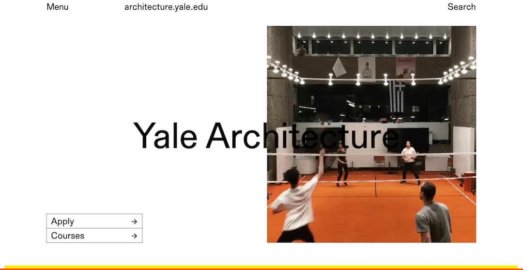
Yale Architecture with CSS
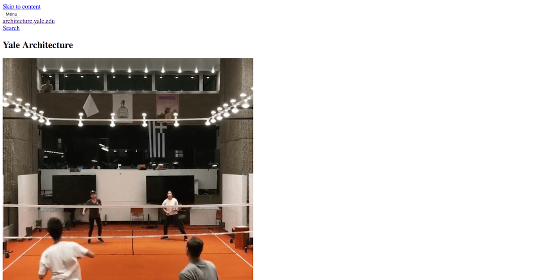
Yale Architecture without CSS
As we've discussed before, you should take a moment to read a good intro to CSS, such as the MDN page So what is CSS, really?.
As a very short introduction, here are the parts to a CSS rule:
- The Selector is the part before the brackets which selects the element(s) to be styled. In this case, the selector was
p, or the name of an HTML element. - A Declaration is a single rule or line of code specifying which property you want to style, in this case
color: red;. - The Property is one of a number of ways that the browser lets you style elements. Some common properties include,
color,margin,width, andbackground. - The Property value is the part after the colon which tells the browser which appearance of many possible appearances you want to choose. In this case,
redis one way to write a color value, along with hex code (#000000) and rgb (rgb(255, 255, 255)) colors.
In general, the best approach to learning CSS is to learn a handful of selectors and a handful of properties (along with their common values). You can then gradually look up additional properties and expand your knowledge as your design requires more advanced styling.
Here are a few resources to learning CSS properties:
There are way more CSS properties than you could ever memorize. Don't worry about it! Just look up the ones you need when you are working on a page design. You'll be surprised how quickly you start to memorize the common ones.
Where does CSS go?
You can put CSS in a style tag or reference an external .css file.
<!DOCTYPE html>
<html>
<head>
  <title>My Styled Page</title>
  <link rel="stylesheet" type="text/css" href="css/custom.css">
  <style>
    p {
      color: red;
    }
  </style>
</head>
<body>

</body>
</html>
Selectors
The most common ways to select an element are by element name, class, or id.
<div id="cancel" class="button large">Cancel</div>An id is a unique name for a single HTML element. Elements can only have one id and an id can only refer to one element.
A class is a name for one or more HTML elements. Elements can have many classes.
In this case, I wouldn't use div as a selector for this element since I probably have many other divs on the page.
I could use #cancel to select just this element (note the hashtag which signifies an id selector), but I probably want my button styles to apply to all buttons on the page.
In that case .button is probably the best way to style this element and other buttons (note the dot which signifies a class selector).
.button {
  background-color: lightgray; // selects all elements with button class
}

.button.large {
  font-size: 18px; // selects all elements with button and large class
}

#cancel {
  color: red; // selects just the element with cancel id
}
Since styles cascade or add up, the above CSS would make the above button element show a lightgray background, a large font size, and red text.
Common Property Values
Colors
Colors can be represented 1 of 4 ways. Usually a color picker tool will show you all 4 values:
- Name:
red - Hex Values:
#ff0000← this is the easiest to copy and paste when you're lazy. - RGB Values:
rgb(255, 0, 0)← this is probably the best since it's precise and readable. - HSL Values:
hsl(0, 100%, 50%)
For more info, see color | MDN.
Lengths
A variety of properties require specifying a length value. There are a lot of types of length values, but here are the common ones:
- px: pixels e.g.
100px - %: percentage relvative to an element's parent e.g.
50%← this is useful for some things like columns that are a percentage of the width of their container - em: relative size compared to font-size of the element e.g.
1.5em - rem: relative size compared to font-size of the root
<html>element e.g.1.5em← this is the most flexible since things will change sizes naturally as you zoom in and out of the page - vh, vw: equal to 1% of height or width of the browser window e.g.
50vh← this is useful for stuff that needs to be fullscreen
For more info, see length | MDN.
Many CSS properties are self-explanatory. You can probably figure out how to use font, color, background, border, box-shadow, text-decoration, and opacity.
My favorite overlooked CSS properties are white-space and letter-spacing for making precise typography style changes.
Layout
Layout in CSS is unfortunately less intuitive. It is, however, quite predictable once you learn some simple rules.
Box Model or "how things are spaced inside elements"
Conceptually, every element is structured like a rectangular box:
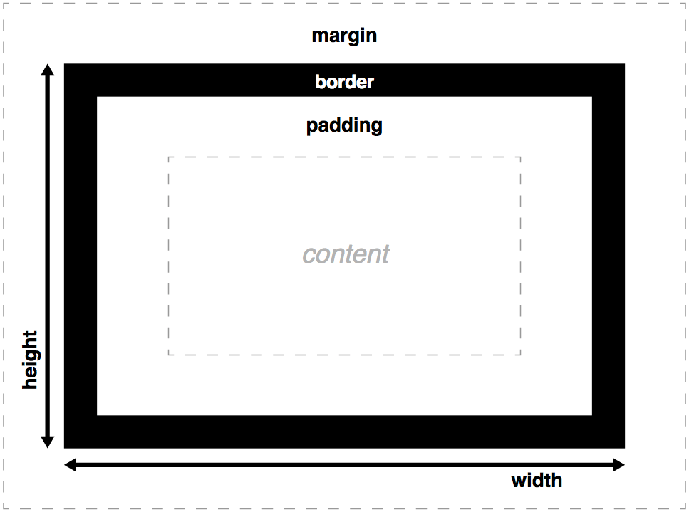
The box-sizing: border-box; model
box-sizing: border-box; is the most intuitive box model because the width and heigh of the element include its border and padding. Unforunately, it's not the default one. To opt-in add this to the top of your CSS file:
*,
*:before,
*:after {
  box-sizing: border-box;
}
For more info, see box-sizing | MDN.
Element display types or "how elements flow on a page"
There are a number of display values, but the most common ones are:
display: block;Take up any available width, regardless of content & begin on a new linedisplay: inline;Take up only the width of their content & continue on the same linedisplay: flex;Like block elements except with the ability to conveniently position child elements inside (see below)display: none;Removes the item from the page completely
All HTML elements have a default display type. Can you guess which common elements are block and which are inline?
For more info, see display | MDN.
Position or "how to nudge elements out of their default flow"
There are a number of position values, but the most common ones are:
position: static;Default, doesn't do anythingposition: relative;Nudge an element in any direction relative to where it startedposition: absolute;Nudge an element in any direction relative to the nearest parent element withposition: relative;position: fixed;Position an element relative to the browser window and make it stay there
In order to "nudge" an element in a given direction, use the top, bottom, right, and left properties.
For more info, see Positioning | MDN.
Flexbox
Flexbox is a relatively new set of CSS properties that makes it easy to do a lot of things that were previously difficult in CSS. That power comes at the expense of a large number of options.
You should use flexbox any time you need to layout a number of items with specific intent about how things are centered and aligned.
Pick and choose options from a guide like the CSS-Tricks Guide to Flexbox.
For more info, see Flexbox | MDN or try the Flexbox Froggy game.
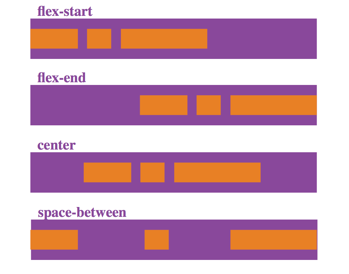
An example of Flexbox alignment options
One of the most common uses of flexbox is to organize your page into columns:
.container {
  display: flex;
  justify-content: space-between;
}
.container .columns {
  width: 33.3333%;
}
If you see CSS layout examples using something called a float, you should try to avoid it at all costs. Flexbox largely supersedes float-based layout and will save a lot of unnecessary frustration with previous limitations of CSS.
CSS Resets
Different browsers have different default styles for elements. It's helpful to start with a clean slate by applying a normalizing css "reset."
For example, Chrome applies padding: 2px 6px 3px; to default button elements while Firefox applies padding: 0 8px;.
You can read more about resets in general here. It's good practice to include something like normalize.css in your html page before your custom css.
Additional Topics and where to read more about them
Media Queries & Responsive Design
In order to make designs change in response to different environments or screen sizes, you can use media queries to conditionally apply different styles.
Animation
You can use CSS to animate styles and create motion on your page. Here is an introduction on MDN: Using CSS animations
Browser prefixing
Not all browsers support all CSS features. You can use these resources to see how widely the feature is supported:
The most common CSS property that requires prefixing is transform:
.example {
  -webkit-transform: rotate(30deg);
      -ms-transform: rotate(30deg);
          transform: rotate(30deg);
}
Chrome DevTools
DevTools is indispensible for seeing the results of CSS changes live.
See the updated tools guide for DevTools tips and tricks.
CSS Frameworks
Writing lots of CSS by hand can take a long time for complex designs. You can use a CSS framework to instantly add a polished theme to your page.
Check out these frameworks to begin:
Assignment 5: Modify and understand the CSS for the Manet example
Download the updated class folder from GitHub and open 2-style/ in Sublime Text.
Note: if you want to explore how developers share code, try to figure out how to install Git / GitHub Desktop to sync updates from the class folder automatically.
Understand the CSS behind the page and modify it change the layout.
- Try to use a different flexbox option to arrange the main images in a different manner.
- Try incorporating some code from a CSS framework to make the site look more polished.
- Try adding a media query to make the site look good on a small screen.
Assignment 6: Add CSS to your class project
Continue building your project and add CSS to start giving your pages structure.
- How will your site look? Will it be inviting? Mysterious? Spartan? Baroque?
- What does your content need to appear correctly? Why don't the default HTML elements suffice without CSS?
- What is the smallest amount of CSS you can write to get the desired result?
- How did last week's HTML layout hinder or aid your CSS coding process?
Assignment 7: Pick an example website to explore in class
Find a website that has an interesting layout. Try to understand (broadly) how the site uses CSS to accomplish the effect.
Come to class ready to discuss examples together.